
A case study was developed for the FCamara Training Program with a team of three UX/UI Designers and two Back-end and Front-end Developers, for 15 days.
MY ROLE
As a UX/UI Designer I collaborated with all the research (desk research, benchmarking, CSD matrix, interviews), wireframing, features roadmap, usability tests, and style guide.
GOAL
Make access to technological learning practical for different levels of experience, generating opportunities, and prioritizing learning among the FCamara team.
OPPORTUNITY
Growth of the technology market with the covid-19 pandemic, requires a high demand for professionals from different branches of industry. People in career transition to the tech area.
SOLUTION
Platform to find technology people mentors to answer questions about the specific area or guide in learning new technological or personal/professional skills.
Introduction to the Challenge
The challenge posed by the FCamara Group’s Training Program is based on the premise of rapid technological advancement in Brazil and in the world and, as a result, new professionals seek opportunities to enter the field.
The creation of “[…] a platform where you can find technology people with different knowledge to answer your questions about the area or guide you in learning new skills.”
Thus, with the proposal launched to be developed and delivered within a period of 15 days, Squad 09 of the Training Program focused on extensive research on the theme of the challenge.
Following the Double Diamond methodology of Design Thinking (Discovery, Definition, Development, and Delivery), some tools were used to deepen the research, namely: CSD Matrix, Desk Research, Benchmarking, Quantitative Research, Interview with Users, Personas, User Journey, and Usability Testing.
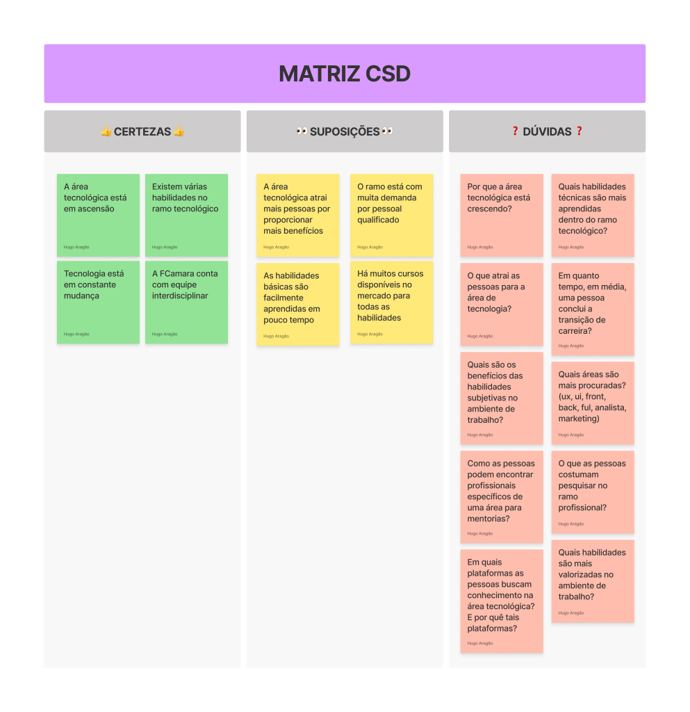
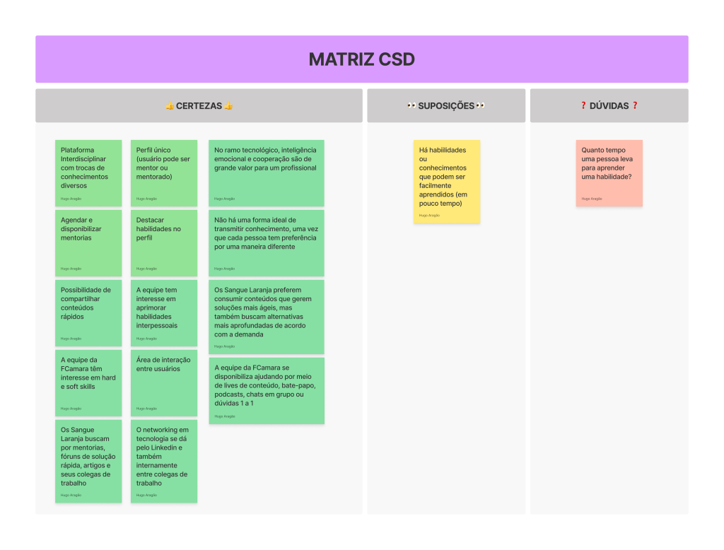
Discovery
Certainties, Assumptions, and Doubts about the proposed problem
Desk Research
The CSD Matrix allowed us to perceive that many of the Certainties, Assumptions, and Doubts were directly related to similar subjects. So, we defined the following relevant terms: Career Transition, Interdisciplinary Career, Mentorship, and Democratization of Knowledge. Therefore, to better understand and contextualize the proposal, a Google search was carried out for articles, reports and the like that addressed these terms, that is, Desk Research.
Research has shown us that the technology market has been growing significantly since the beginning of the Covid-19 pandemic (2020 — present), having grown by 23% since the period and, consequently, requiring a high demand for professionals from different branches of industry.
From this, we noticed that interdisciplinarity (sharing of knowledge and exchange of experiences between people) is a recurring factor within technology companies and that this practice promotes several advantages for companies and for the team that compose them, such as providing a more agile workflow, facilitate problem-solving, have a broader view of the steps within a project in the work environment.
Definition of an initial problem within the proposal
After the data collected by Desk Research, we traced the following problem involving the proposal launched by the FCamara Group:
“How to make access to technological learning practical for different levels of experience, instigating social interaction, generating opportunities and prioritizing learning among the FCamara team?”
Benchmarking
With the problem defined, we looked for some direct and indirect competing platforms that we thought would meet the same question. For this, we searched for platforms for online courses and mentorships, as well as social networks. The chosen ones were: Cambly, ADPList, eMentor, Mentorize, Alura, and Tik Tok (indirect competitor).
From the Cambly platform, analyzed by me, we highlight the homepage with the functionality of the recommended and available teachers.
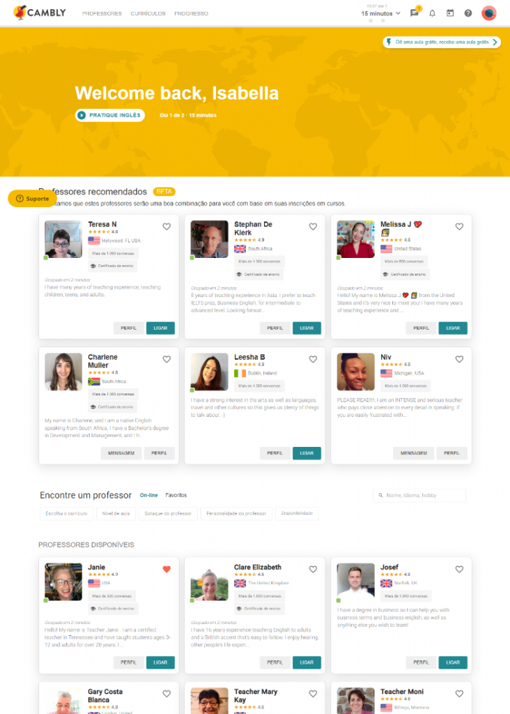
For the analysis of competitors, the following factors were taken into account: If the profiles are flexible; If the application has a 1 to 1 mentoring session; If you have a joint session; Whether the mentors’ skills are highlighted on the website; If you have a schedule of dates and times; If it has a chat system; It has a question and answer section; And if shared skills encompass both hard skills and soft skills.
Application and Functionalities
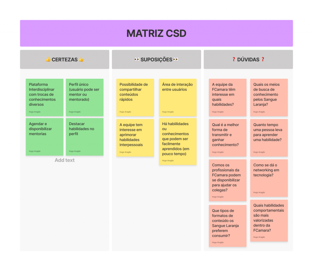
Following what was analyzed by the Benchmarking survey, we decided to create another CSD Matrix, this time, filling it with Certainties, Assumptions, and Doubts more focused on the functionalities of the application itself, as can be seen below:
Quantitative Research
In view of the issues raised by the second CSD Matrix, the group opted for the development of quantitative research to deepen the issues raised. This survey would initially be launched on Linkedin and would be aimed at all technology professionals. However, due to the delivery time factor and the fact that the challenge proposal was, at the time, exclusive to FCamara’s internal team, we decided to limit the completion of the survey to internal members of the company.
Thus, we created a form on Google Forms with a series of multiple choice questions and single checkboxes with the option “Others” enabled, in order to learn a little more about the context of the internal members, the Sangue Laranja, in the technological field, as well as their behavior within the company itself. The questions addressed questions about each user’s area of expertise within the company, as well as seniority level, aspects related to cooperation between members, places to search for knowledge, and the importance of hard and soft skills within the team.
The survey was launched in the challenge’s general chat, with the premise that it was exclusive to the Orange Bloods. However, this launch in the general chat caused us a setback, which was the completion of the survey by other challenge participants due to lack of attention in the launch text, which ended up invalidating the results obtained and causing us to cancel the Qualitative Survey scheduled for the next step.
User Interview
In conversation with mentors, we chose to discard the Quantitative Research, since it was invalidated, and cancel the Qualitative Research that would be scheduled to be elaborated next. So we decided to conduct a direct voice chat interview with users. For this, we had the presence of four internal members of FCamara, being a Junior UX Designer, a Junior Product Owner, a Senior Front-end Developer, and a Tech Manager Developer. The interview script followed as an adaptation of the Quantitative Research and, as the interview unfolded, we asked new questions according to the insights obtained at the time. From this, the interview provided even more relevant information about the context and routine of the company’s users, enabling a better refinement of definitions for the project. We were able to confirm that the values of cooperation and interdisciplinarity between people are a reality within the company. We also realized that the FCamara team seeks knowledge in a variety of ways, mainly by consulting with their own co-workers, and that the mentoring system was not known by some of the interviewees.
Personas and User Journeys
With the information from the interview, we were able to draw two profiles of personas, encompassing the information provided by the interviewees and taking into account the value of diversity within the FCamara Group. They are the personas Lucas (Senior Developer) and Maria Luísa (UX Designer Trainee). Thus, we were able to define a context for each one, as well as their main tasks, their pains and needs, and, consequently, possible solutions for them. Once the personas were drawn with their particularities, we were able to build a User Journey for each one, analyzing the possible interactions of the personas as users of our project.
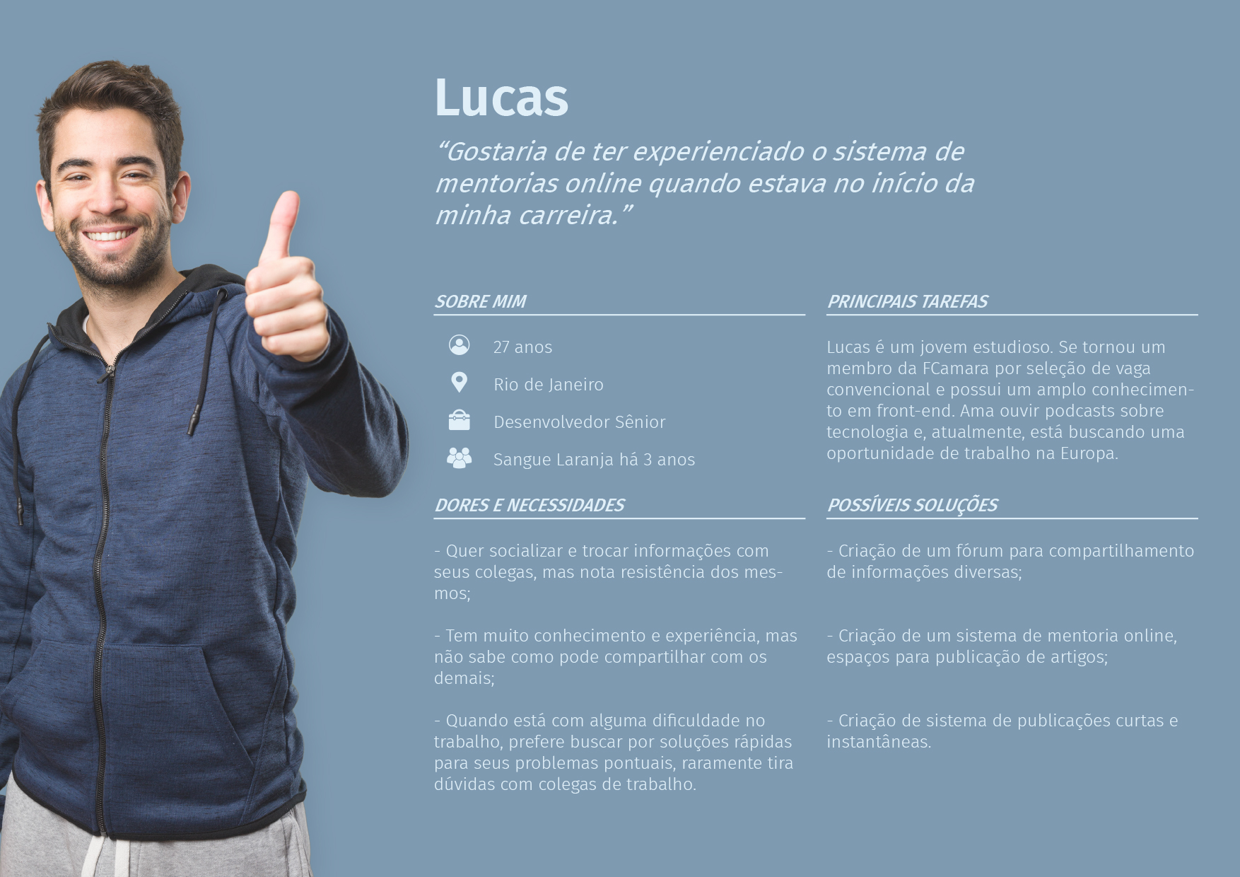
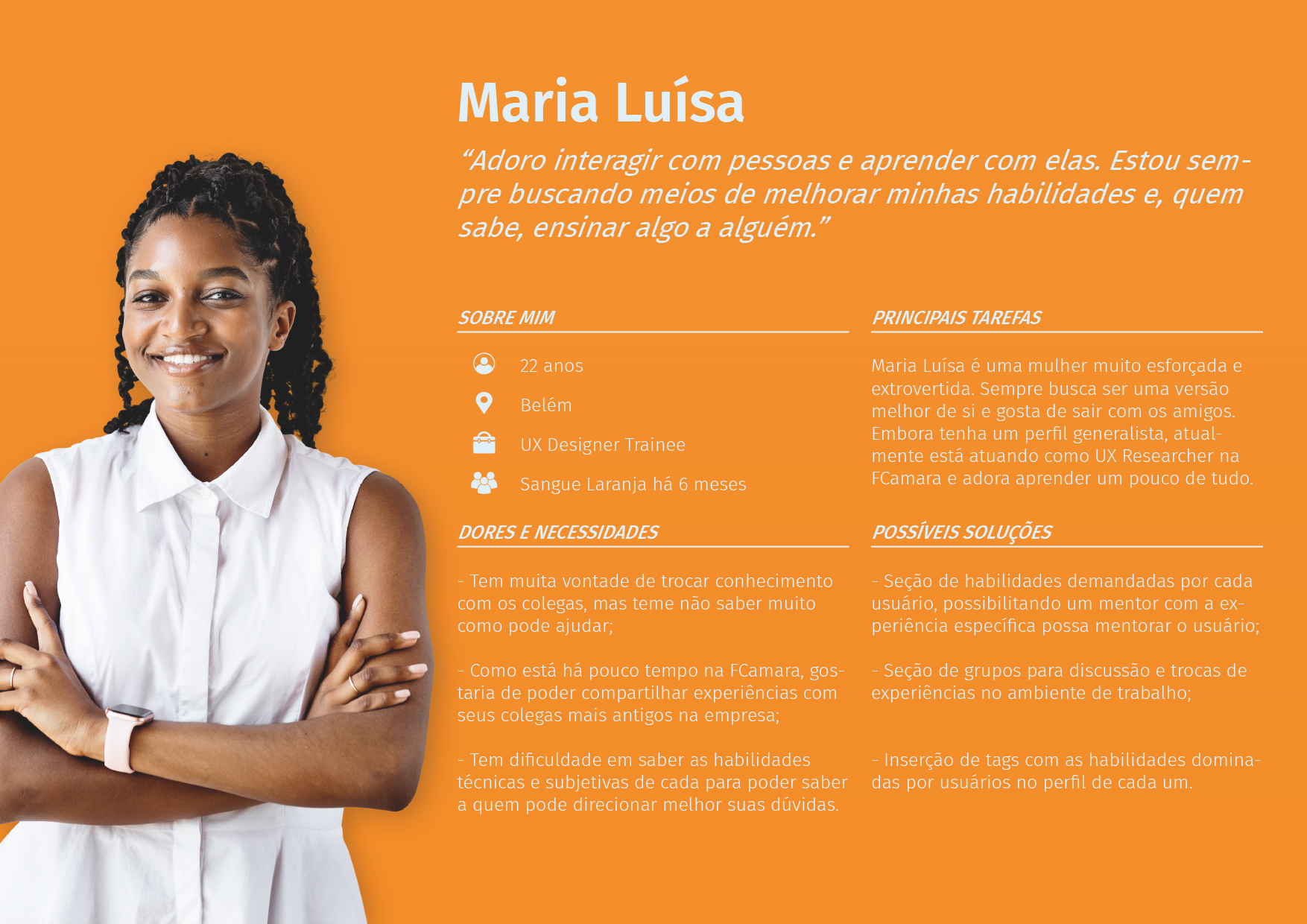
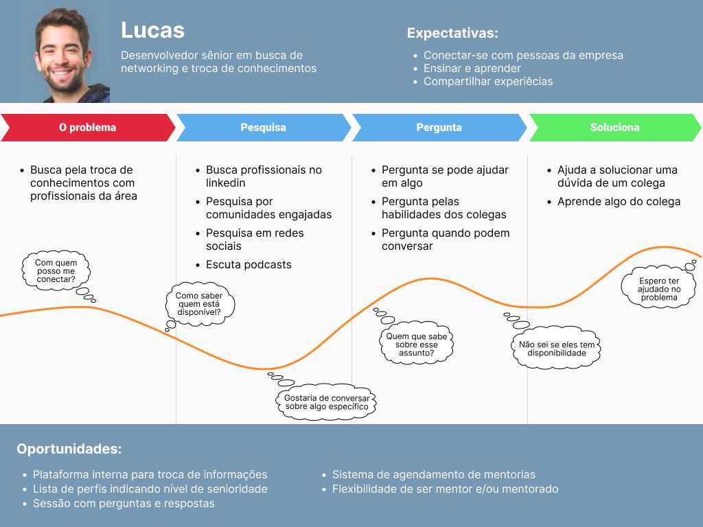
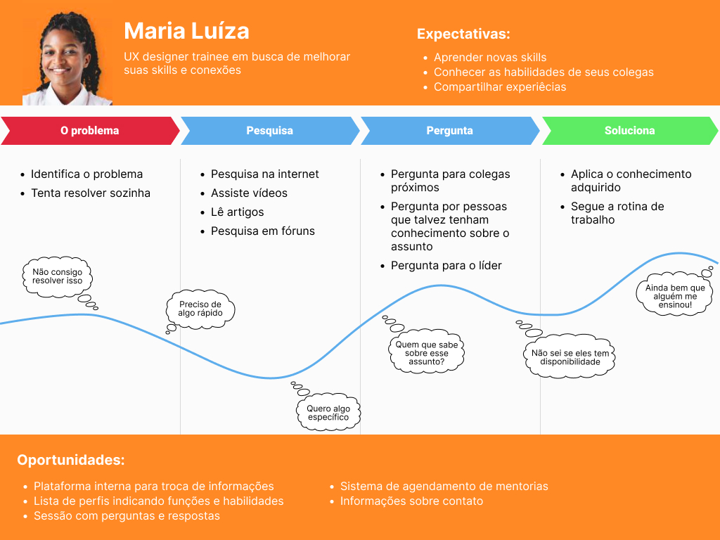
Once the personas were drawn with their particularities, we were able to build a User Journey for each one, analyzing the possible interactions of the personas as users of our project.
Definition
Insights from sketches
With the research stage completed, each member of the UX/UI Design group prepared schematic sketches e in the web format of the application in order to compare and define priority features that could be used in each sketch. In this way, we collect all relevant insights to be prioritized as application features, namely:
- Scheduling mentorships;
- Flexible user profile (everyone can be mentored and mentored easily);
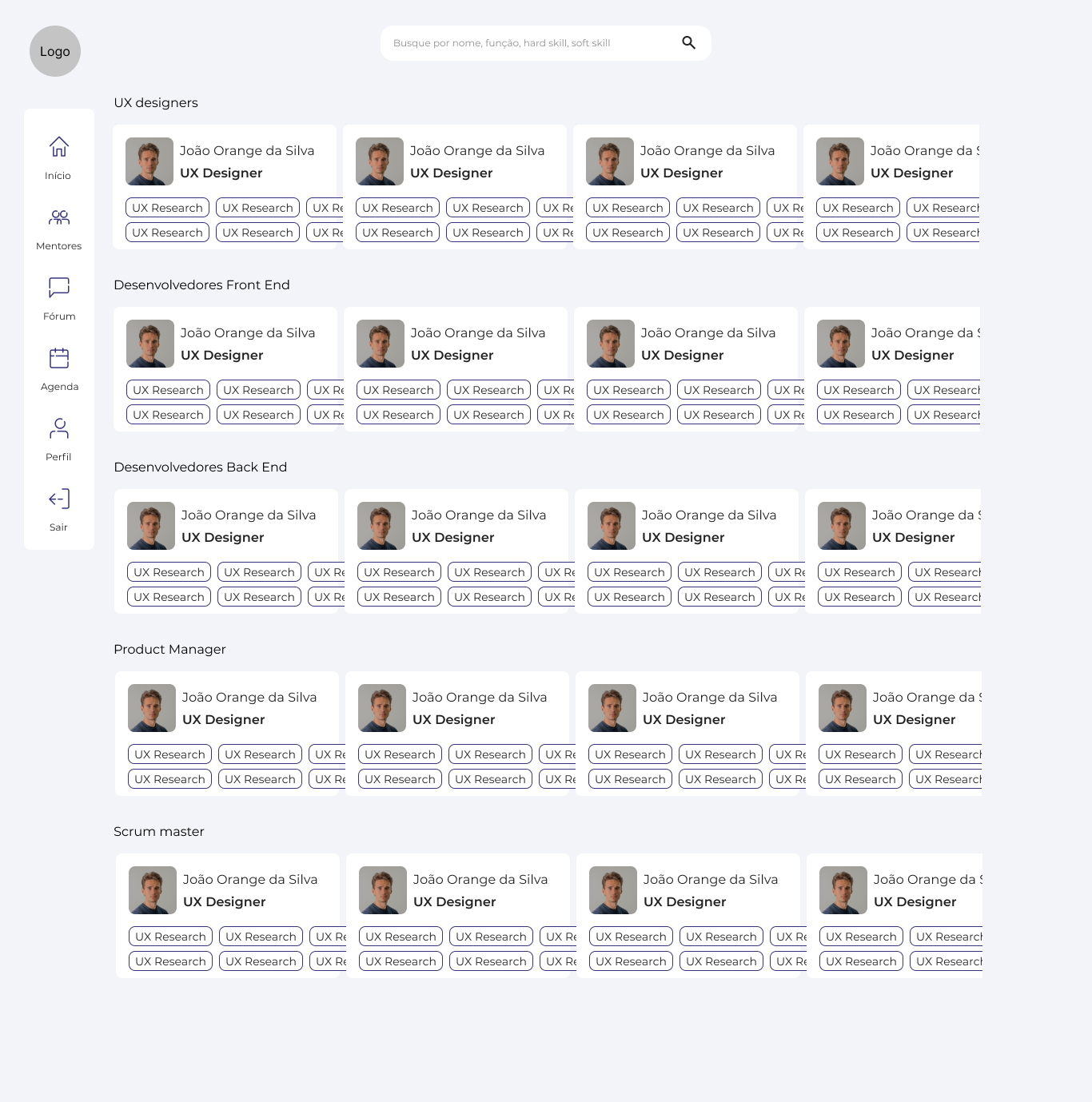
- User catalog by soft and hard skills with the possibility of specific search;
- Discussion forum zone;
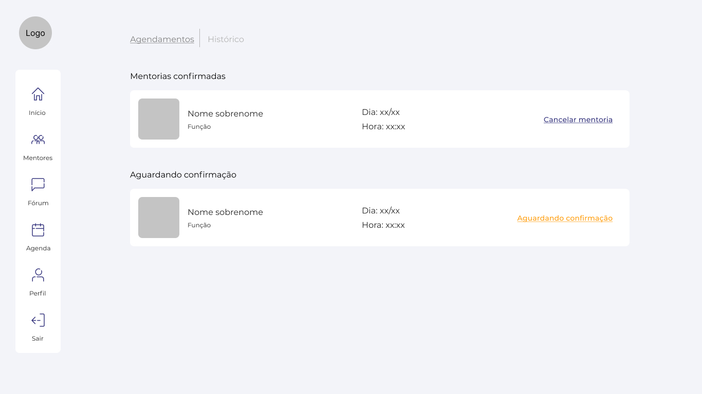
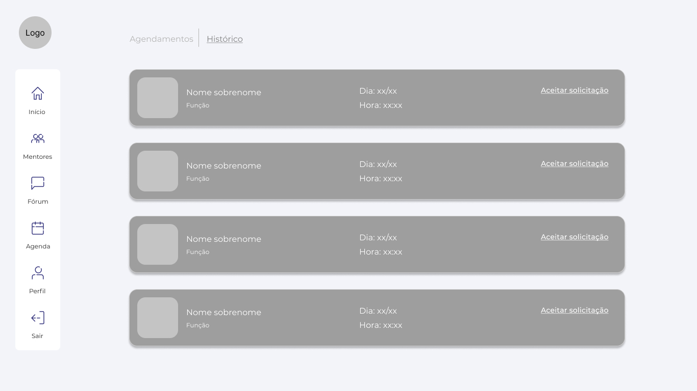
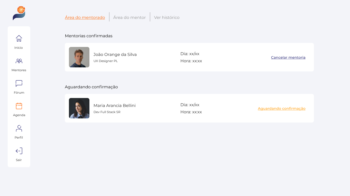
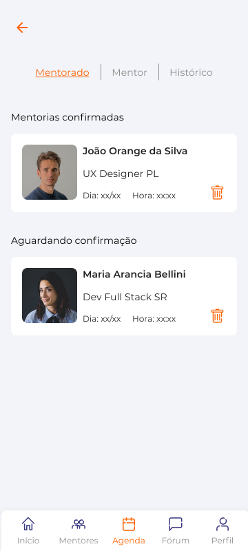
- Consultation of scheduled mentorships (confirmed or awaiting confirmation);
- Separate scheduled mentorship sections in: “Mentor Area” / “Mentor Area” / History;
- Availability to accept mentoring (choice of dates and times);
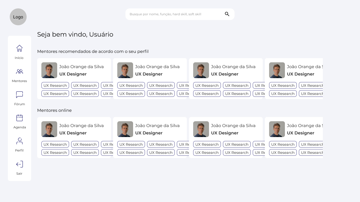
- Zone of recommended mentors according to the user’s profile;
- Online mentor zone available at the time of access.
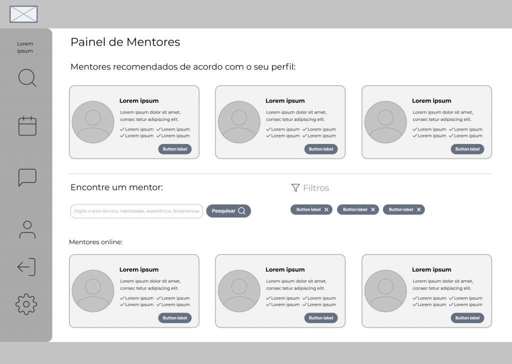
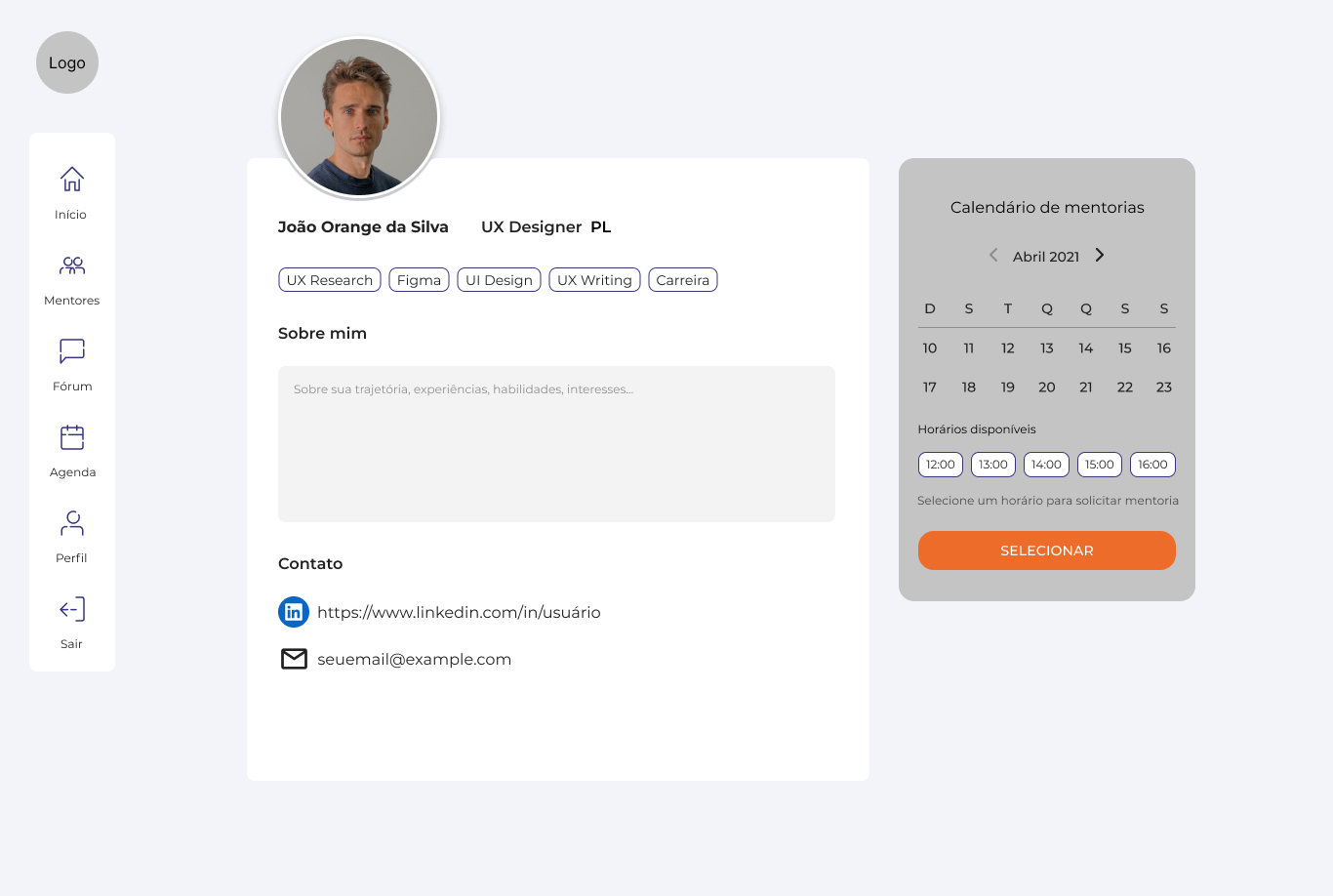
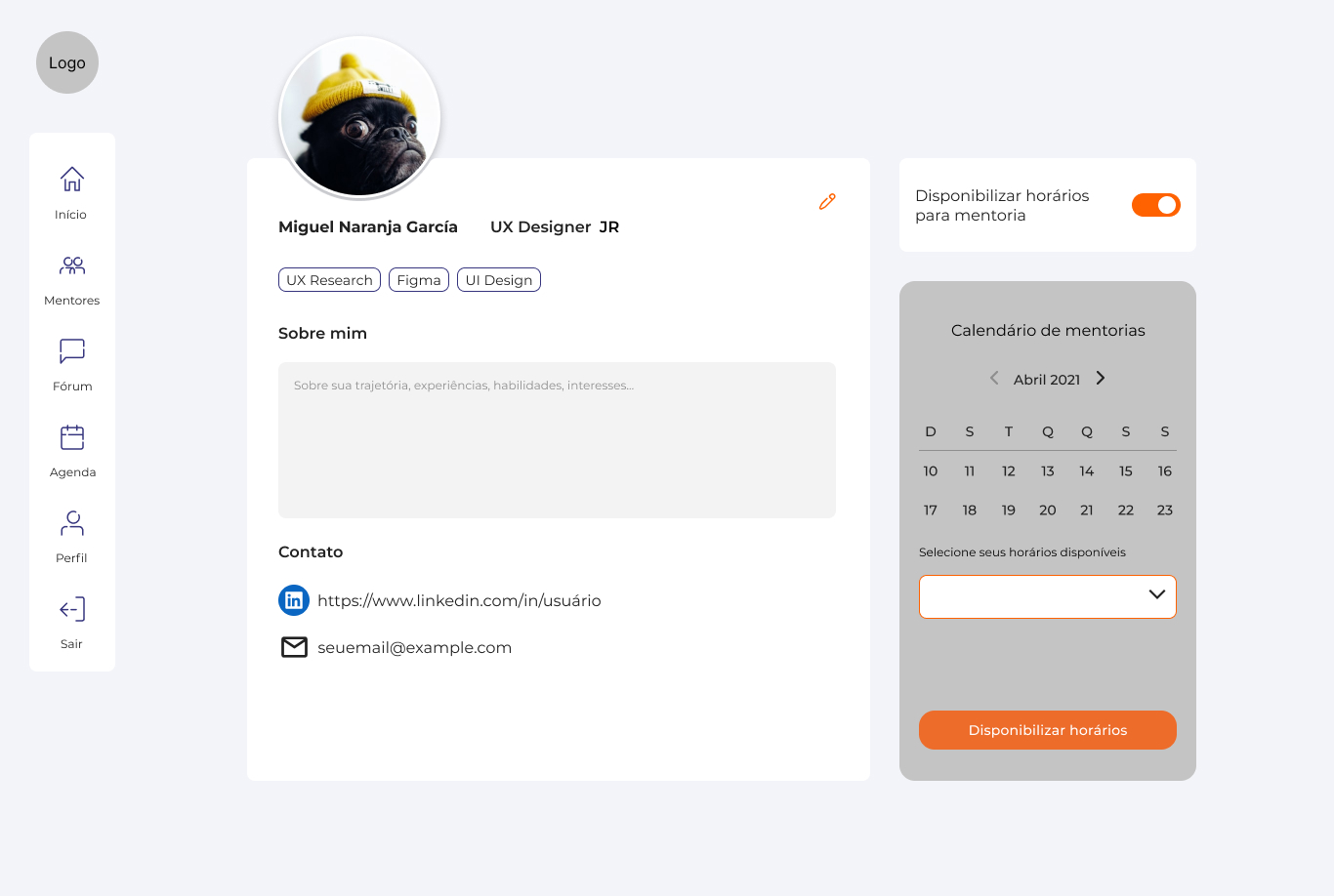
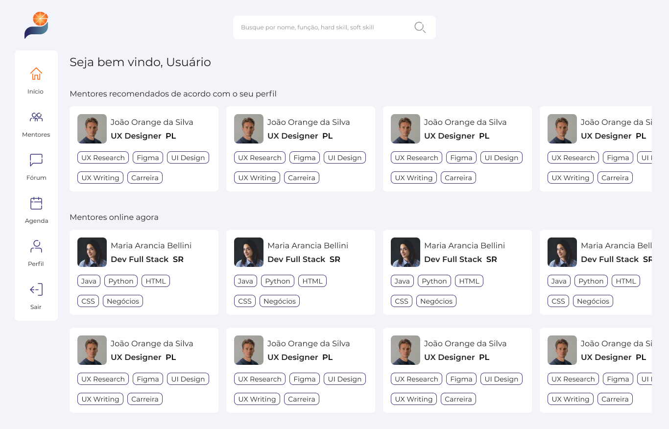
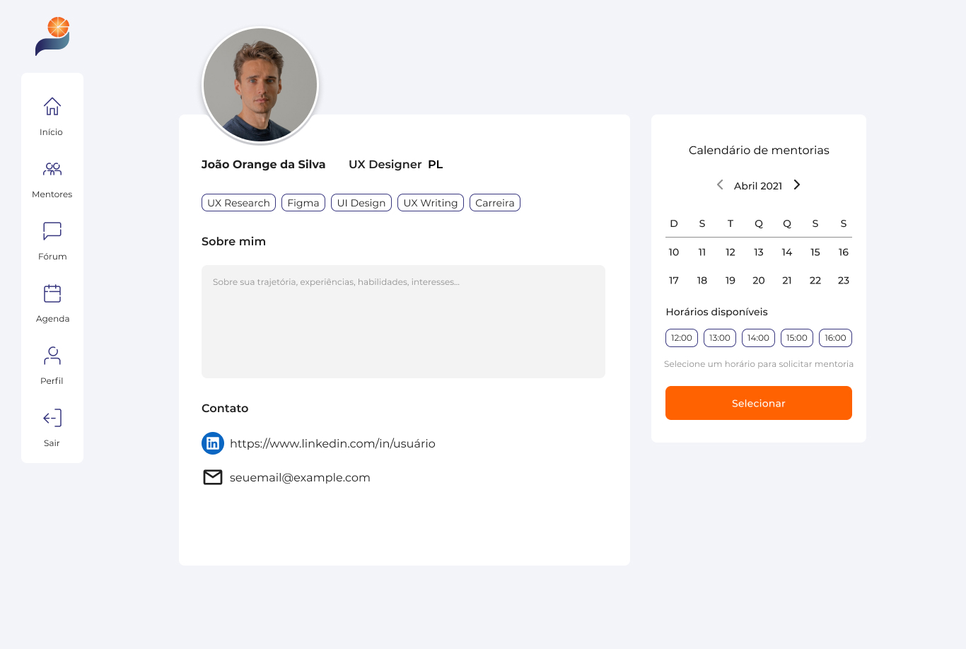
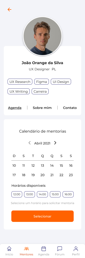
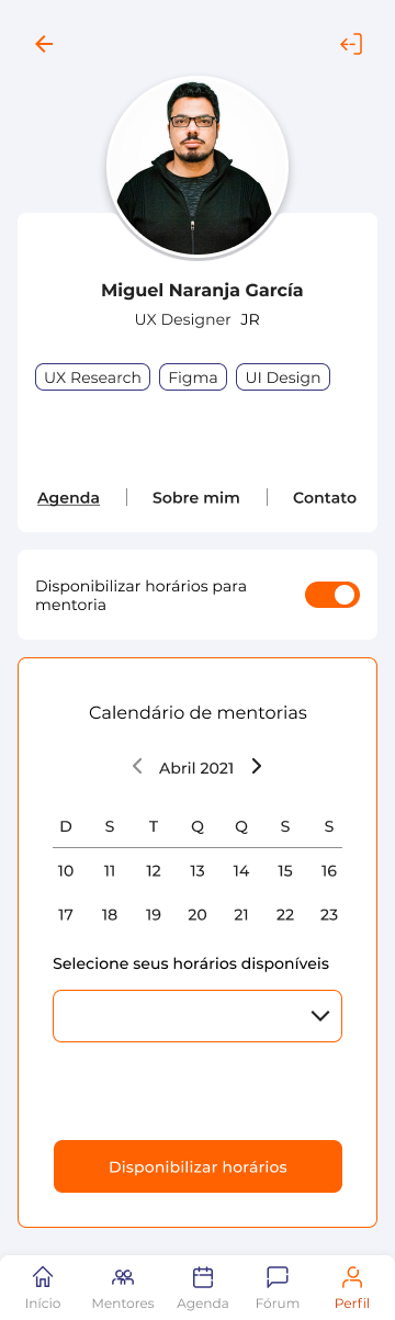
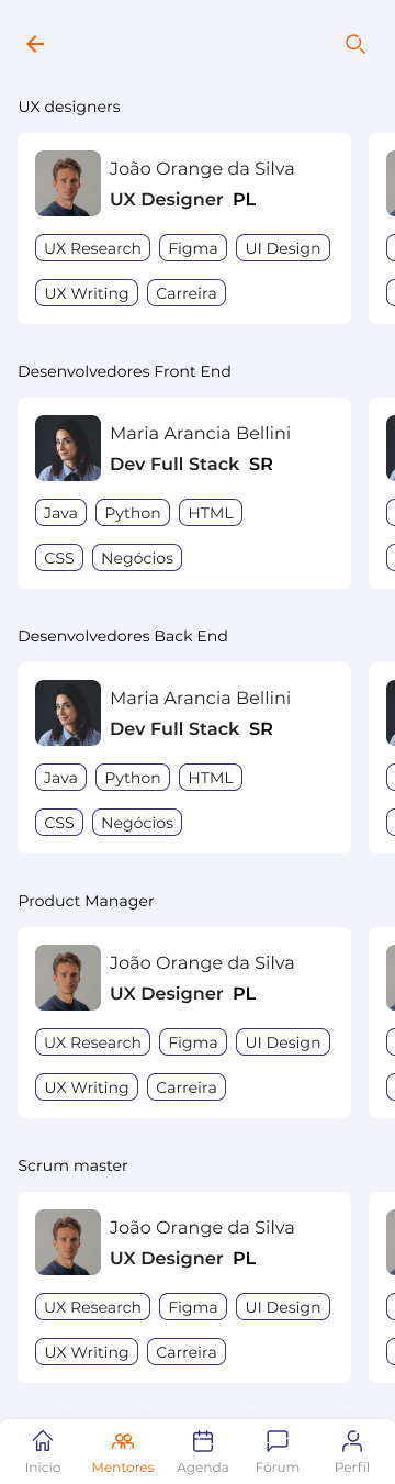
Definition of working screens
Discussing on top of the prioritized features and taking into account the MVP (Minimum Viable Product), we arrived at the elaboration of five fundamental screens for the application:
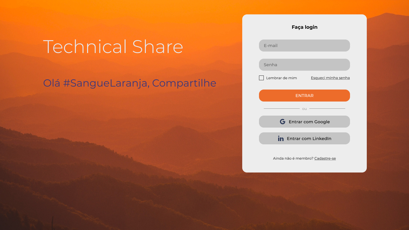
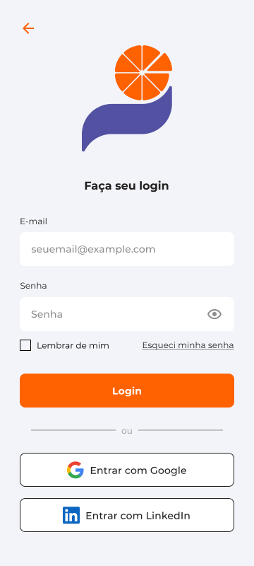
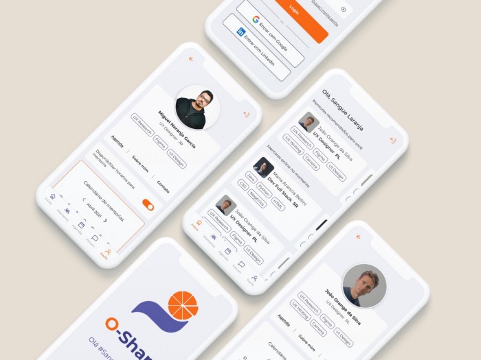
- Onboarding (Login and Register);
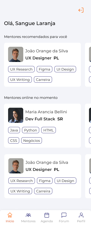
- Homepage (recommended users and users currently online);
- Mentoring Catalog;
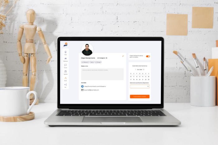
- Profile (personal and from third parties);
- Scheduled Mentorships (adding mentor zone, mentee zone and history zone).
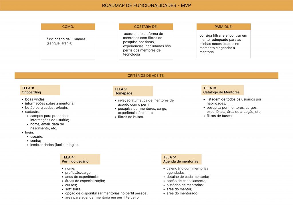
Features Roadmap
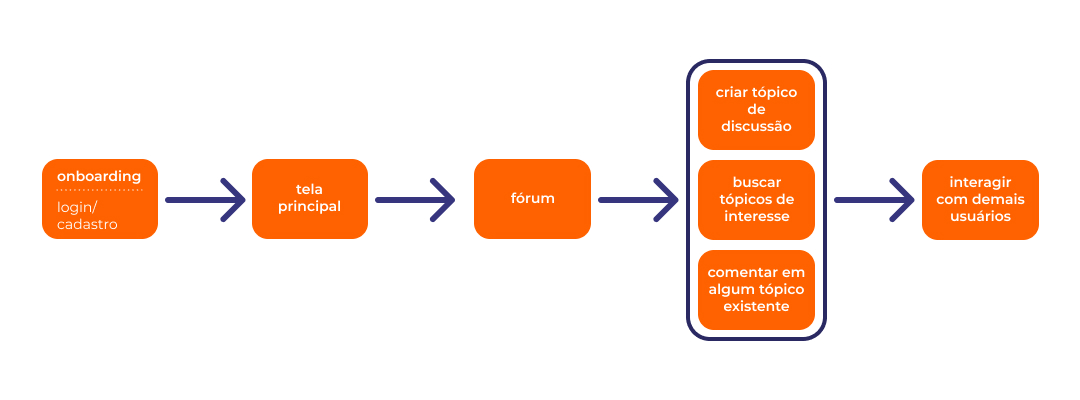
After defining the application’s prioritized screens and functionalities, we created a Functionalities Roadmap in order to organize the functionalities corresponding to each screen. We opted to leave the forum functionality for a future increment, in view of the delivery time. In addition, we defined in the Roadmap how the user would like to access the application and for what purpose, following the scheme below:
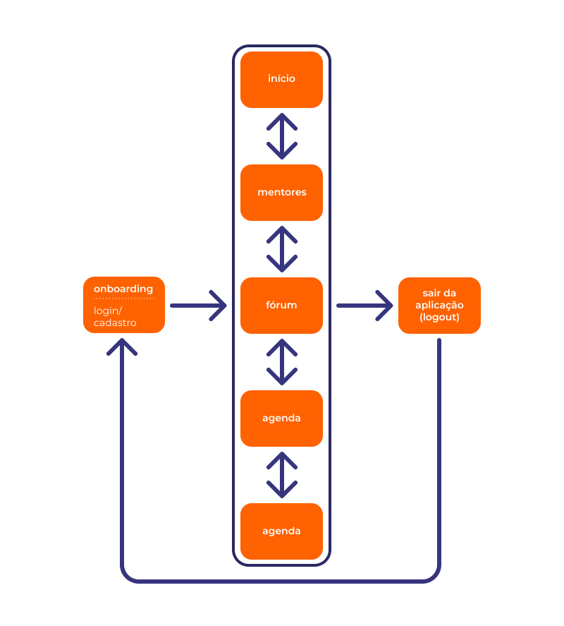
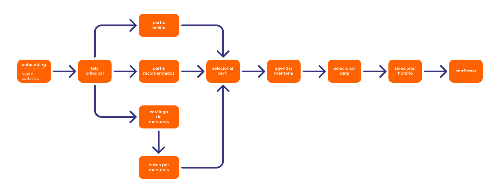
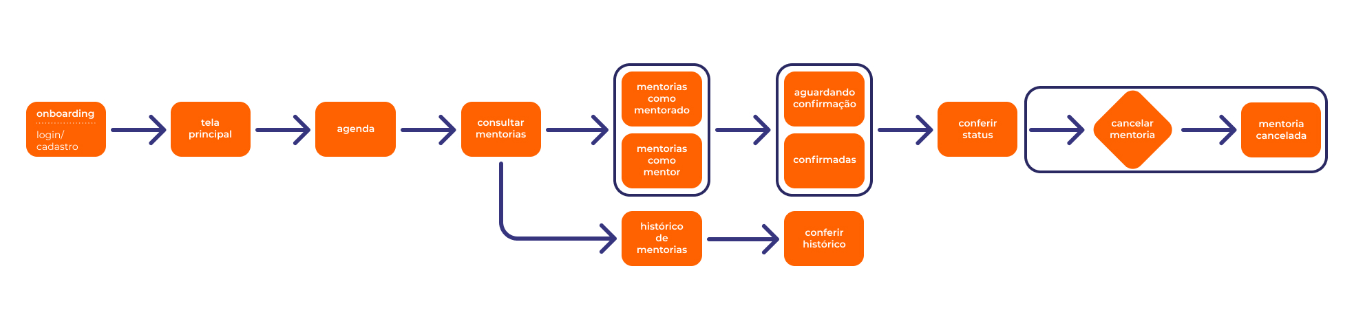
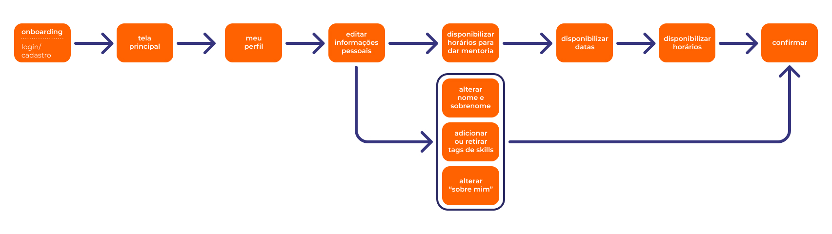
User Flow
The User Flow was made to highlight the user’s step by step when performing a certain action. For this reason, it was separated by flows for each screen, and an overview of access to the application’s functionalities was also drawn, from the moment of login to the moment of logout.
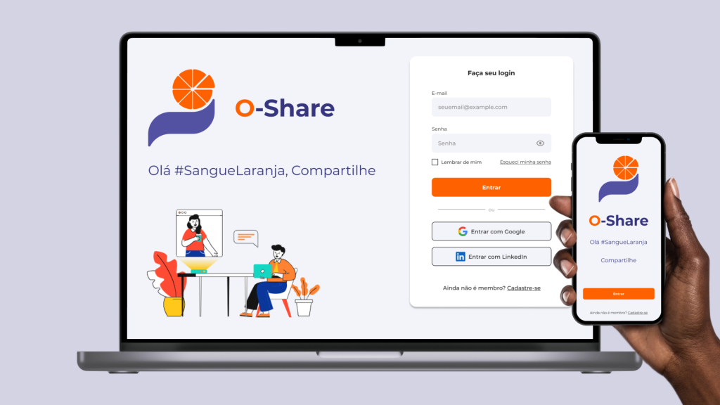
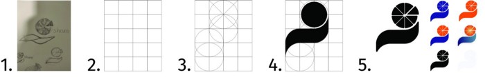
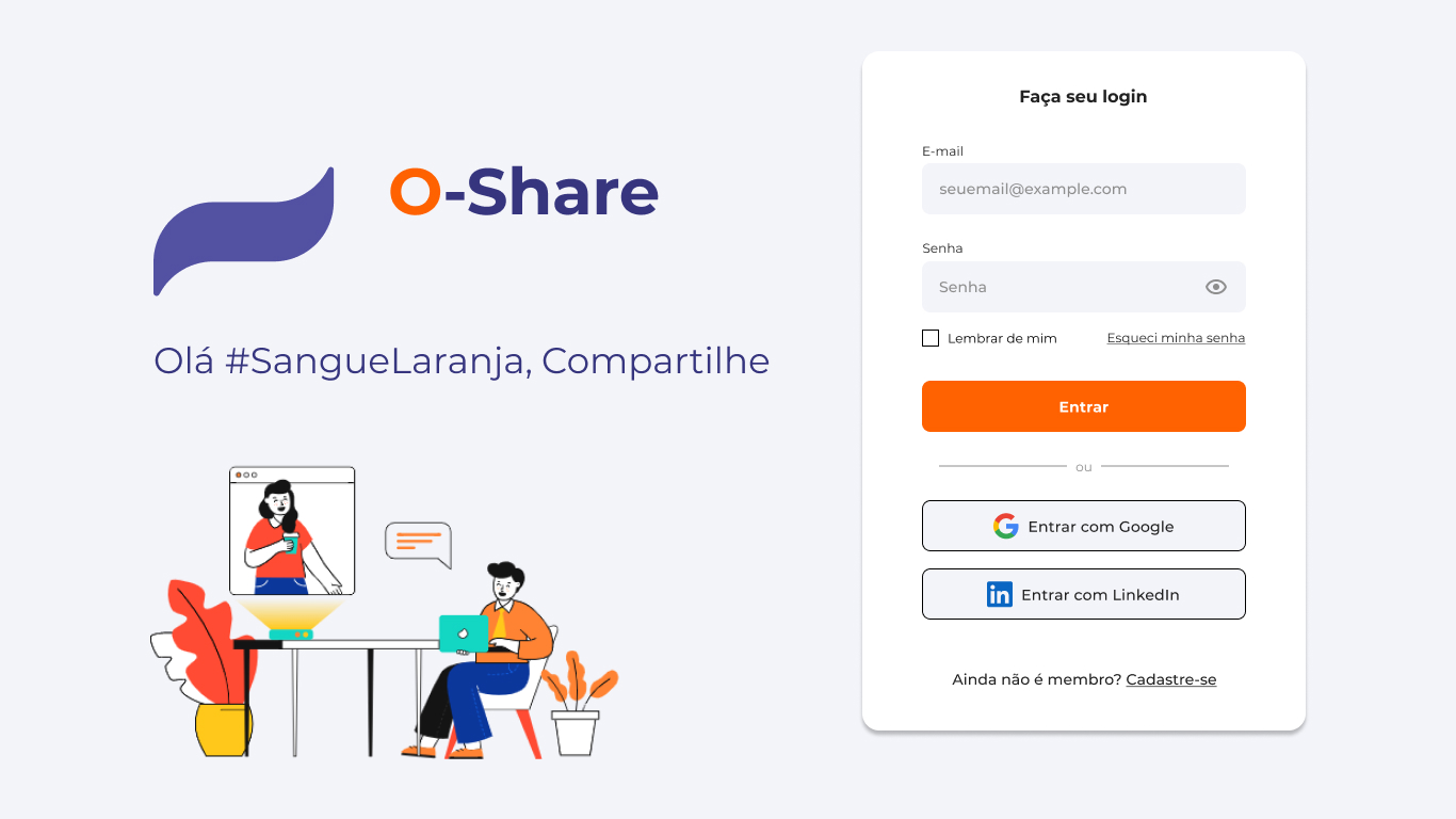
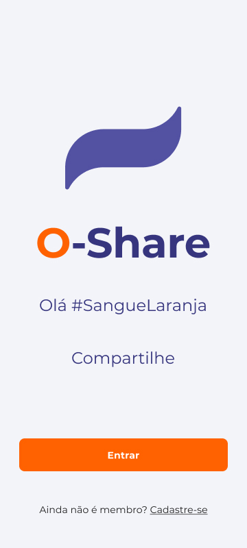
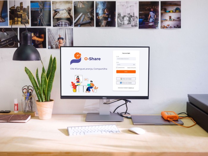
Name and Logo
The choice for the name of the application was “O-share”. It starts from the composition of two words of English origin: Orange (orange) and Share (sharing), capturing the essence of the Sangue Laranja team, as well as the values of the company FCamara of interdisciplinary work and the culture of cooperativeness in the company’s work environment.
The logo that identifies the platform was also created.
Value Offer
In this way, we launched a Value Proposition for our application:
O-share is a platform that aims at the full exchange of experiences between people in a practical, agile and assertive way. With a simplified mentoring system and varied profiles of Orange Bloods, O-share facilitates the cataloging of each user’s skills, making it possible to schedule mentorships between people with a few clicks. In addition, the platform understands the importance of each experience for the user, therefore, we are not limited to sharing technical skills, we encourage exchanges of life experiences and skills of the emotional and behavioral spectrum, highly valued in the current technological market. Finally, our flexible profile system allows the user to be mentored or mentored simultaneously, leveraging FCamara’s values of horizontal sharing between people, without any hierarchies of experience levels.
Development
Wireframes in Low-Fidelity (Web)
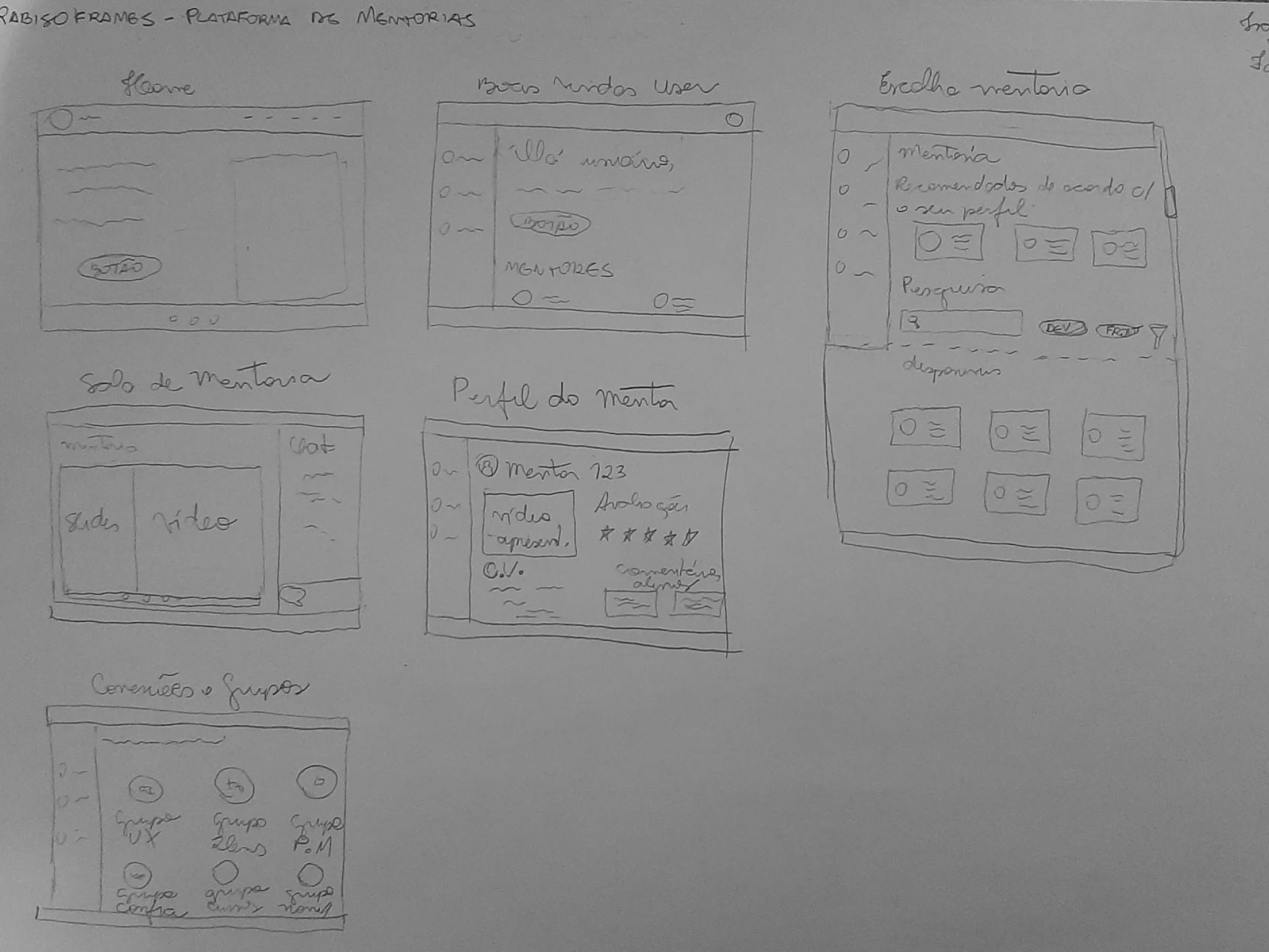
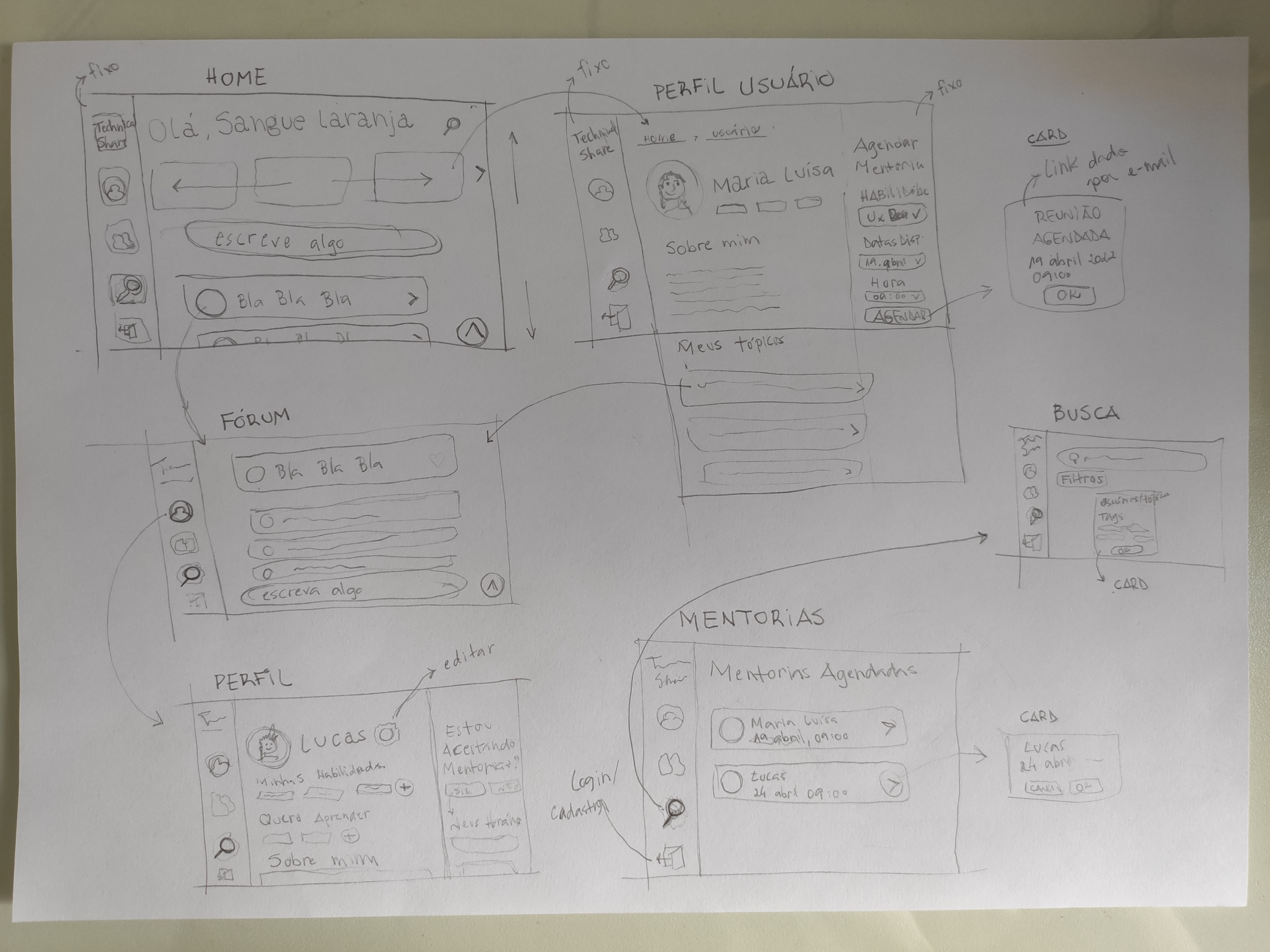
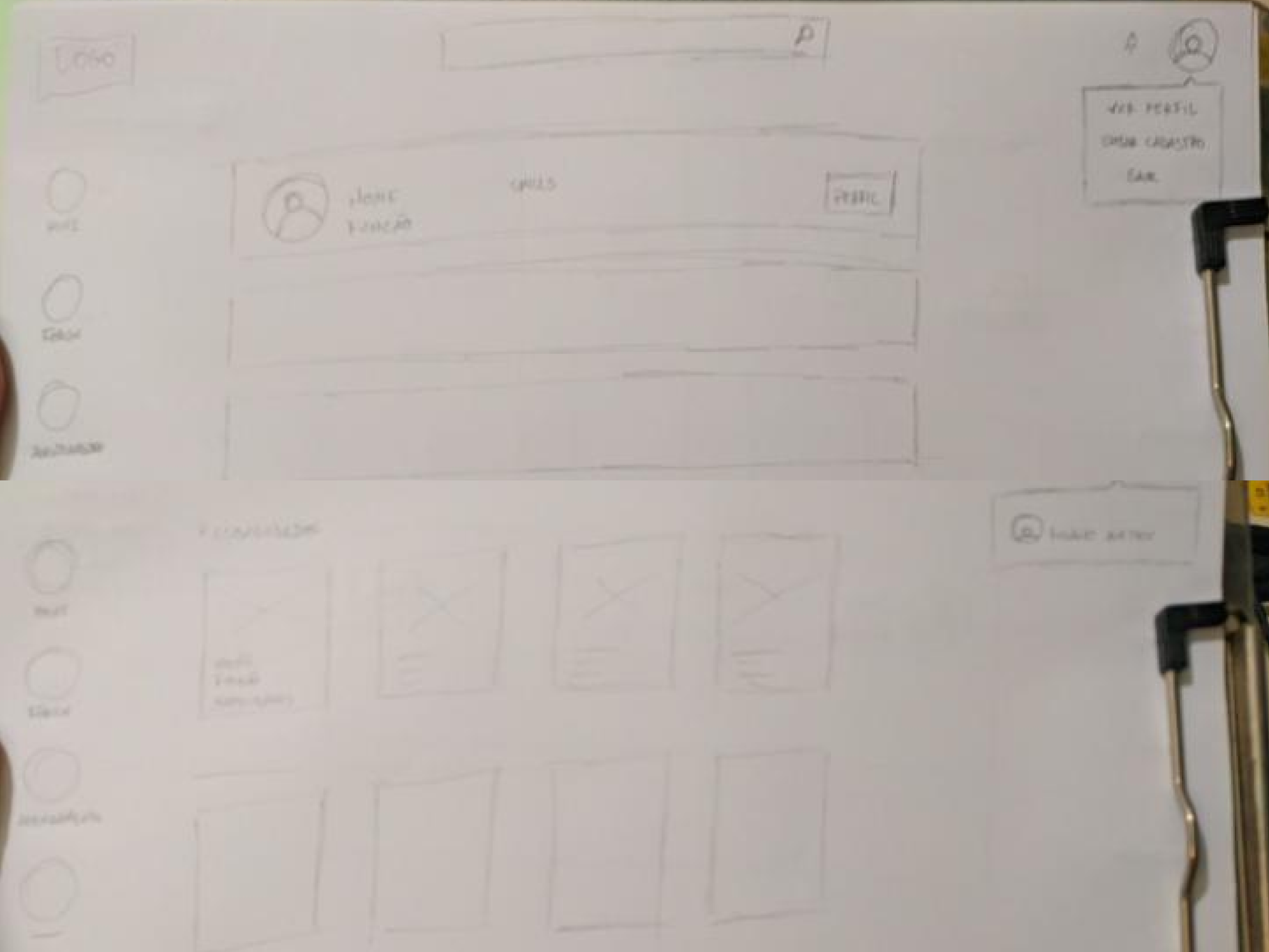
Based on the schematic web sketches and the functionalities and screens to be prioritized, each member of the UX group created a wireframe in Low Fidelity Web in order to define a base layout and standards for organizing the screens. Below, is my version:
Wireframes in Medium-Fidelity (Web)
After analyzing the wireframe versions in low fidelity, we selected the items and functionalities that made the most sense for O-share’s objective and made the wireframes in medium fidelity.
Check out here our Web prototype in Medium Fidelity here.
Usability Test
After finalizing the wireframes in low and medium fidelity, we move on to Usability Testing.
We performed a usability test of the prototype by Maze.co, wich was elaborated by me, with 3 tasks for the user to perform. The 5 selected users are #SangueLaranja and contributed to our project with the following tasks:
- “Imagine that you have doubts and need to log in and schedule a mentorship with a Product Designer, on 04/11 at 2 pm”;
- “Now that you have requested a mentorship, check if the request has already been confirmed”;
- “You would like to have a mentor profile and make yourself available to mentor. Available on the 22/04th, times at 15h.
Our objective was to verify that users could understand the flow of the platform, manage to find a mentor in the area, schedule the mentoring, confirm that the appointment was made, and provide dates and times if they wanted to be mentors.
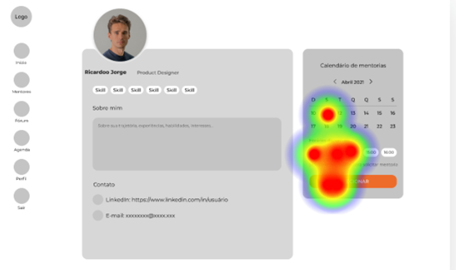
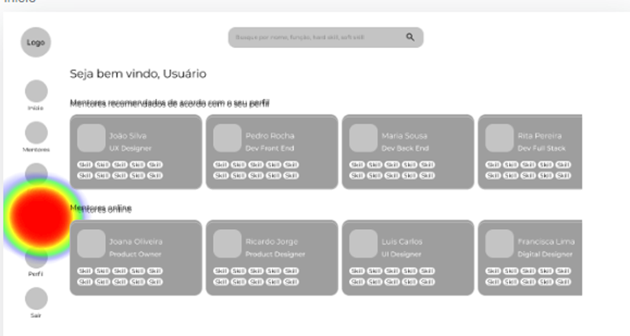
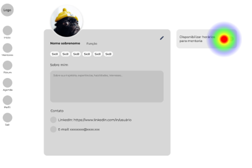
Usability Test results on the application’s main screens according to the suggested tasks.
The results showed that the users were able to complete the tasks in an objective and simple way.
The usability test identified that the path we follow and the solutions we develop are easy for the user to understand. In general, all users were able to make and consult appointments, in addition to making themselves available to be mentors, without major problems.
In any case, we made improvements after the test so that the use was more fluid and pleasant for the user in the prototype in High Fidelity.
It is important to point out that we had a broader vision, but due to the limitations of time and the team itself, we made the best MVP possible.
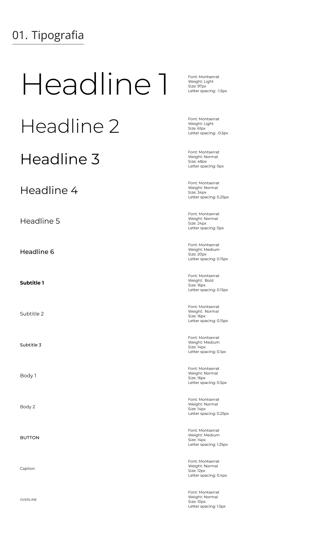
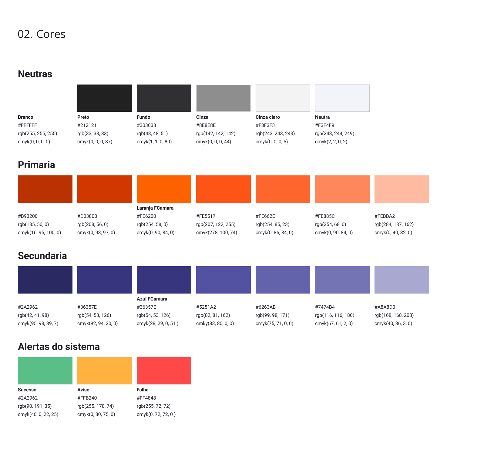
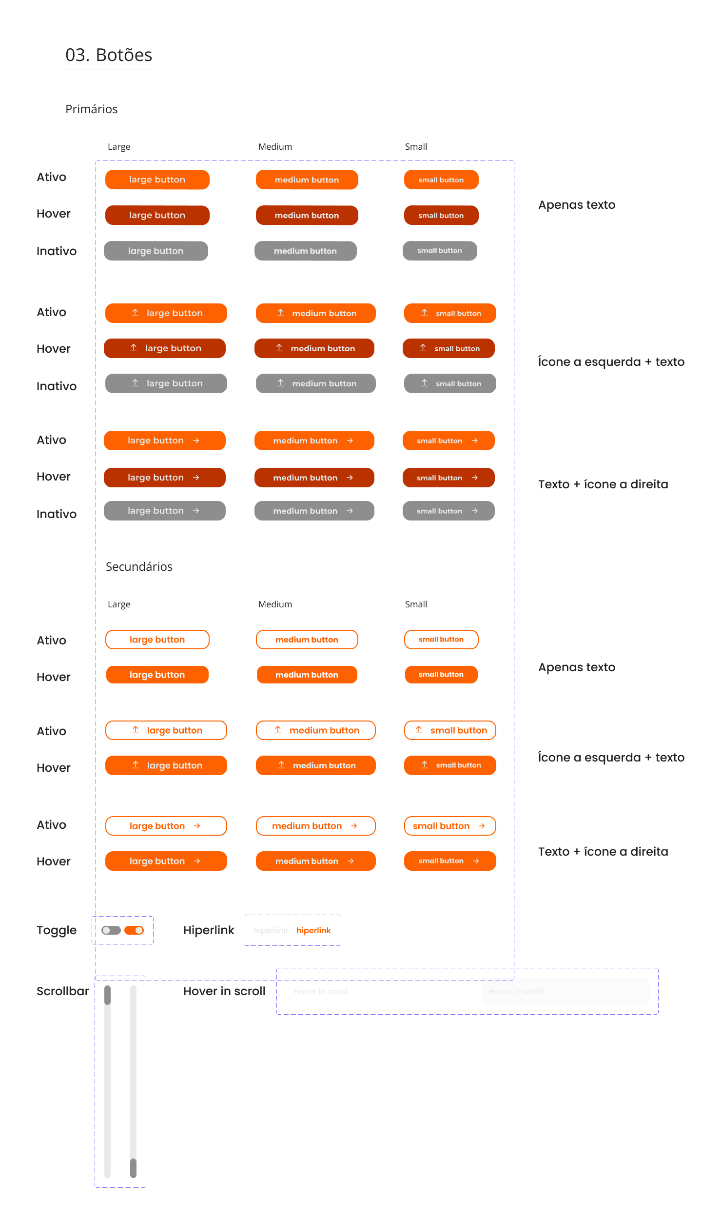
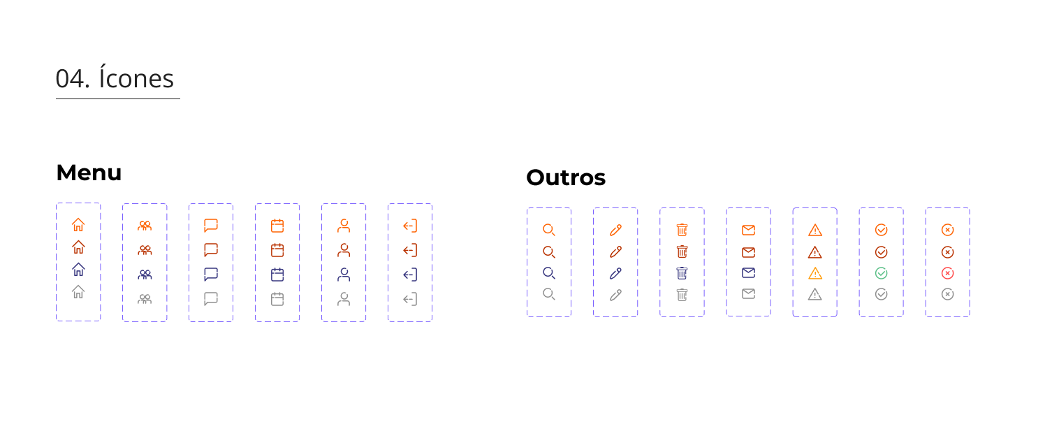
Style Guide
We, especially me, developed a Style Guide in accordance with the guidelines of the Brandbook of the FCamara Group, since, in principle, it is a product for internal use.
The typography chosen was Montserrat, a classic, with variations in font sizes and hierarchy for headers, subtitles, titles, body, and other more necessary ones.
The buttons were designed with variants for each state, such as active, inactive, and hover.
The iconography created also follows the guidelines of the Brandbook provided by the FCamara Group, with stylized icons. We also provide options for changing the state of these icons.
Delivery
Interface Web in High-Fidelity
With the Style Guide defined and with the perceptions collected in the Usability Test, we proceeded to develop the Mobile and Web wireframes in High Fidelity.
After mentoring with the company’s UX/UI Designers, we were able to improve the prototypes, further refining the interface of each screen and consolidating a standard and style cohesion for the application in an overall view. Changes to the High Fidelity Mobile and Web wireframes included revisions to prototype accessibility, design color palette, font hierarchy, button and skill tag formats and sizes, toolbar highlighting, and improved layout organization of O-share screens.
Wireframe Web in High-Fidelity
Check out here the Web Prototype in High-Fidelity.
Interface Mobile in High-Fidelity
Check out here the Mobile Prototype in High-Fidelity.
Pitch and Features
Check out the Pitch video made by me, and the O-share feature video.
Reviewing the CSD Arrays
By revisiting our CSD Matrices, we were able to review them and, with that, many doubts were removed and assumptions confirmed.
For the Future
Thinking about a possible future improvement of O-share, we propose some solutions and new features, in addition to some aesthetic and functional adjustments listed below:
- Improve and refine the application through new usability tests;
- Accessibility check, color contrast;
- Develop Forum for exchange and conversations between O-Share users;
- Enable users to post the demand they want to learn and, if another user has the required skill, he accepts mentoring;
- Group meetings and mentoring option;
- Provision of courses and training outside the scope of FCamara, but related to the area of technology and soft skills;
- Platform expansion to a larger scale, encompassing more users.
Final Consideration
We appreciate the opportunity and all the learning that the Training Program provided us throughout the project development process.
It was challenging to carry out such a unique project in 15 days, with such a diverse and committed team, each with their own particularities. In the middle of this walk, we had an absence of two developer members of our team, remaining the final five members. However, it was a great opportunity for all of us to be able to experience teamwork of this magnitude, so we could better understand how an interdisciplinary company works in real life. In addition, it was rewarding to be able to connect with people from all over the country and to be able to evolve not only as professionals in the technological career but also as people.
The effort of the entire Squad 9 team, the mentors, and the staff who contributed to the evolution of each member. Many thanks to the FCamara Group for providing us with a unique experience.
Links
References
About the growth of the technological market during the Covid-19 pandemic: link 01
On career transition and democratization of education (ease of access to learning): link 02 / link 03 / link 04
On the importance of interdisciplinarity within technology companies: link 05 / link 06 / link 07
On the values of interdisciplinarity within FCamara: link 08
GitHub Project
Check out here the project of our Front-end and Back-end developers on Github.
Team
UX/UI Designers:
Filipe Katasho (Linkedin);
Hugo Aragão da Rocha (Linkedin);
Isabella de Faria (Linkedin).
DeVELOPERS:
Back-end: Victor Souza (Linkedin).
Front-end: Isaías Roberto (Linkedin).