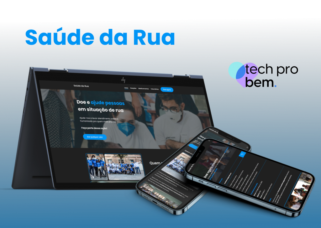
UX/UI Design of Home e Doações pages from website Saúde da Rua made by the UX/UI Designers volunteer team at the Project Tech Pro Bem.
MY ROLE
While UX/UI Designer worked on research (desk research), wireframe, usability testing, style guide, and prototypes.
GOAL
Redesign the entire site for the NGO Saúde da Rua, in terms of usability and interface.
OPPORTUNITY
NGO growth and need for more visibility, recognition, and organization with volunteers.
SOLUTION
A website that demonstrates the competence and work of the NGO, generating credibility as well as accessibility.
Introduction to the Challenge
As Tech Pro Bem Design volunteers, we initially received a proposal to redesign the site, both its usability and interface. So, until that moment we only had the Saúde da Rua website as a visual reference and information about the business, namely:
Saúde da Rua Profile:
Foundation: July 2020.
Location: São Paulo, SP (Headquarters), Campinas, SP (Branch), São Carlos, SP (Branch), São José do Rio Preto, SP (Branch), Itajaí, SC (Branch)
Mission: Bring health in a humanized way to vulnerable populations.
Employees: 7 individuals.
Volunteers: Health professionals and students.
Impact: More than 1,400 medical consultations and more than 1,000 rapid tests performed between 2020 and 2021.
Problems faced by Saúde da Rua:
Vakinha’s platform service fee is high and makes it difficult to receive higher recurring financial amounts;
Lack of a visible list on the website with the medications needed for donation.
The form’s Google Sheet spreadsheet is very disorganized and the managers of Saúde da Rua faced difficulties in handling them.
The demand for students enrolled to participate as volunteers is very high and they do not receive a forecast of when they will be able to participate.
The current website did not convey credibility to Saúde da Rua, vis-à-vis possible institutional donors and individuals.
The current site no longer attracted financial and drug donations from institutions and individuals.
Discovery
We needed to better understand our demand with those responsible for Saúde da Rua. But for that we could not reach the leaders of Saúde da Rua empty-handed. We participated in a joint meeting between the UX team and the UX mentor, where we aligned some points and decided on some tools that would help us in this secondary research. We used three tools, which helped us to put together a questionnaire that would later be used during the meeting with the leaders, they were (Remembering that you can view both in the Tech Pro Bem project in Figma):
Benchmarking: It is a process of evaluating the main competitors.
Matrix CSD: It is a strategic tool for defining certainties, assumptions and doubts about a project.
Desk Research: Desk research consists of analyzing data already available in the market.
With that, we could get informed and ask questions that would give us insights that would help us build the site and better meet their needs. We started to organize our Figma and followed an organization pattern inspired by iFood. After completing the benchmarking and desk research, we were ready to participate in the meeting with the Tech Pro Bem POs and the leaders of Saúde da Rua. At this meeting, we aimed to understand what they expected from the new site, needs, their objectives, how we could represent the Saúde da Rua brand, visual inspirations, the brand’s personality, etc. Always focusing on Street Health: And it was at this meeting that we managed to define some points:
- They wanted the predominant color of the website to be black.
- They wanted the brand to feel modern.
- They wanted the site to feel younger and more relaxed.
- Saúde da Rua produces content on Instagram itself, but it depends on the month if there are many actions or not.
- They wanted to start receiving donations directly to their account via QR Codes.
As the days went by, we aligned how we were going to start developing the project. The idea at first was to go to Double Diamond and choose the tools, but we preferred not to stick to a methodology and we started to organize ourselves internment. We had a meeting where we discussed benchmarking and saw what made sense or not for our project. we started to develop the site’s information architecture, we thought of 7 pages in all, each with its sections and contents, namely:
- Homepage.
- Doações.
- Seja voluntário.
- Ações.
- Medicamentos.
- Sobre.
- Contato.
But over time we discontinued the contact page.
Click here to view the Information Architecture in Figma.
Soon after, we set out to develop the style guide, which included:
- Typography — We chose a more rounded typography, to make it easier to read and at the same time friendly and modern;
- Colors — We performed tests to check the contrast and ensure that they would be within accessibility criteria;
- Buttons — With a rounded edge, conveying modernity and proximity;
- Icons — We used a library of icons, and over time we removed some that we certainly weren’t going to use;
- Forms — Forms with slightly rounded edges, to differentiate from buttons;
- Breadcrumbs;
- Navbar;
- Shadows — We used a library that contained shadows based on Material Design. We didn’t use as much shade in the project, but it’s ideal that we were prepared;
- Grids — We use two Grids based on Bootstrap. The mobile and the desktop.
Click here to view the Style Guide in Figma.
After we had the information we needed (Direct information from the leaders and their interests; Visual references from the competitors) and the style guide, even if in its initial phase, we started to build the pages of the site and until the present moment we have all the following ready pages:
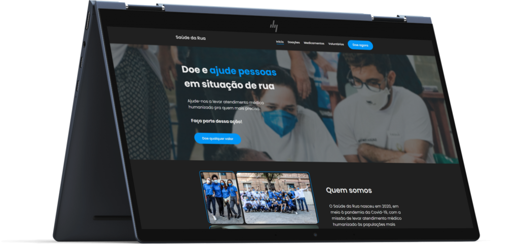
- Homepage — What we want with this page is for it to be responsible for providing quick information, being the point of contact between the user, and the main actions that we aim for according to the needs of Saúde da Rua, which are the increase in donations and recruiting volunteers. In terms of visuals, we wanted the page to have a fluid reading and be dynamic for the user (Play with the way he reads and visualizes the page. That it didn’t have content that was boring and tiring to read).
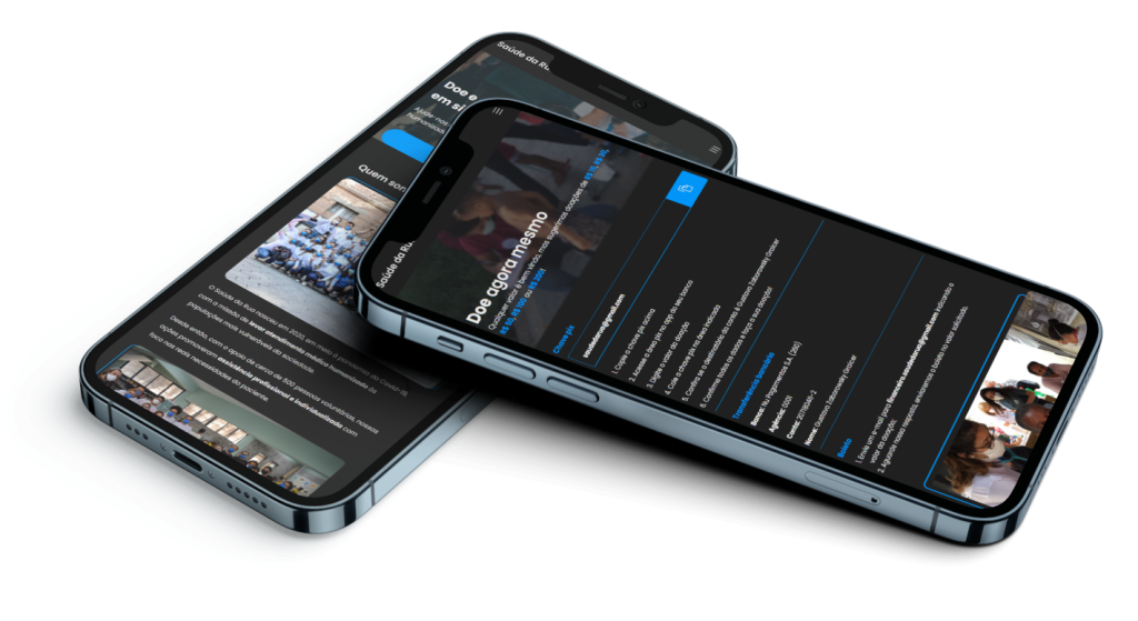
- Donation Page — the goal is to make it possible to donate amounts already predefined via PIX since it is the most used means of payment by donors. There is also the alternative of donating other amounts and buying products from the Saúde da Rua store by donating indirectly. We paid attention so that the page was clear and objective and conveyed the credibility of the work carried out.
- Admin Panel — a dashboard so that volunteers who work in the administrative part of the NGO can access the site to edit some information and create users.
- Volunteer registration form— an online form so those who want to be volunteers can apply to contribute by working on Saúde da Rua’s incredible mission to help others. The goal is that filling out the form is a good experience for the user, easy and fast, without significant bureaucracy.
Click here to view the finished pages in Figma
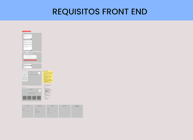
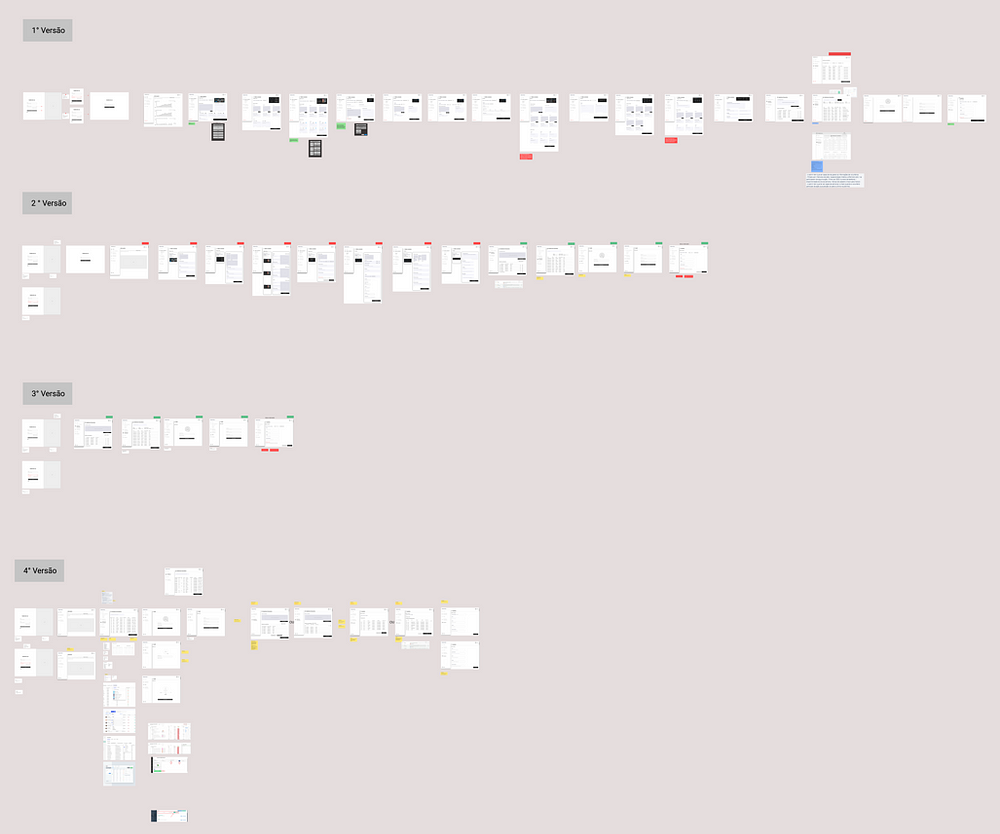
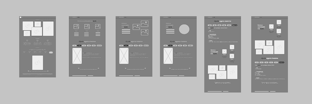
Explaining a little the process of building the pages. We always start with wireframes in low fidelity (because it saves time and effort; and we can validate ideas faster). Then, we take the scribbles to the superiors (Team leader and mentor) in order to validate what is being proposed, if approved, we take it to the PO who will tell us if that page meets the business requirements, if so, we proceed to the wireframe in high fidelity and then we take it to the superiors and if they approve it, we send it to production (remembering that at all times we need to be aligned with the other teams, to have an idea of what can be done or not). According to the POs, we should prioritize some pages to speed up the project delivery. From there, we started with the Homepage (Defined in a meeting), which would be our first increment. Just to give you an idea of the process:
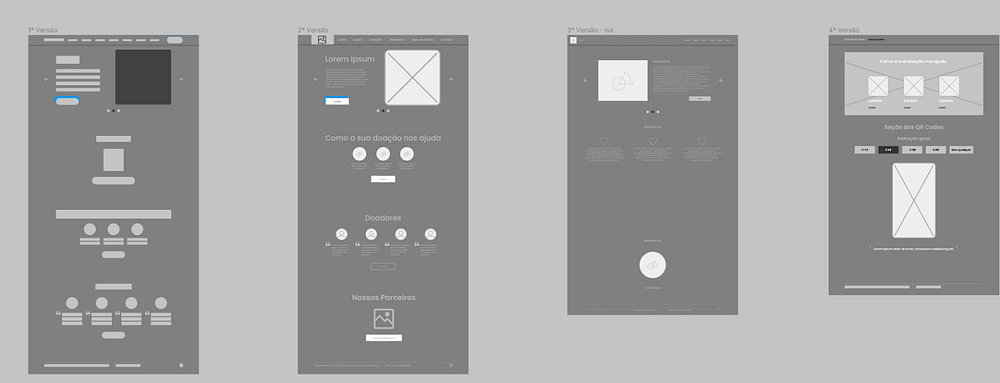
We worked on these low wireframes, but we didn’t pay enough attention to them, we went straight to the high wireframe and that ended up delaying the development process of this page. Look at the difference in how much effort we spend on the low version and the high version:
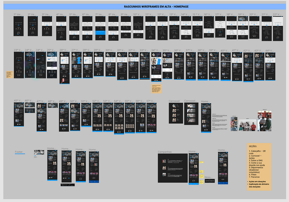
At a certain point we managed to deliver our first page and there was a party, but the work could not stop. Then we started to develop the next pages that were foreseen in the information architecture according to priority. You can check this through the Information Architecture mentioned above.
It is worth mentioning that we do not delete anything and everything that is not the final version is just a draft. So, we leave it saved in separate files in case you need to consult or go back to any version.
At this moment, you must be wondering if this content will be static, if it will never be updated or how the leaders of Saúde da Rua would do this. And that was also the doubt of Tech Pro Bem employees. That’s when a need arises that needed to be discussed together for a while, but which resulted in the creation of the Admin Panel and which was more of a demand of ours (With regard to the experience and the interface), it will be through it that the employees of the Saúde da Rua may update some information on their website.
Tests
We structured the Admin Panel according to the main needs of Saúde da Rua employees.
The main requirements were: creation of access logins to the Admin Panel by the Admin Master, management and control of the Volunteer Worksheet and management of the Financial Reports available on the website.
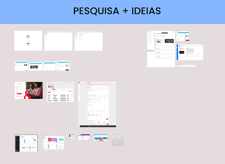
We looked for references and inspirations and created the first versions of the Admin Panel. I leave here the ones I created, but I emphasize that all teammates created their versions too. This phase was very important to develop techniques in Figma.
The screens underwent revisions and corrections, improving functionality and appearance:
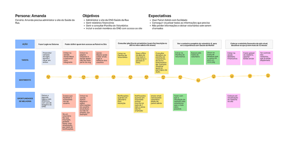
In order to verify the usability of what we design, we prepare a usability test.
For this, we built a proto persona, in addition to defining the User’s Journey.
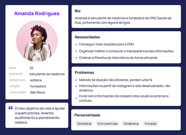
So, Bárbara and I did a usability test with 2 volunteers who manage the NGO.
The test was moderated by the Zoom platform, with screen sharing and spoken description of the activities carried out.
Check out the Figma prototype.
The proposed tasks were as follows:
Scenario: Imagine that you have already entered the Dashboard, logged in, and now you are on the homepage. We are going to assign some tasks, according to demands that arise on a daily basis for the administration of the NGO and the website.
1 — Pedro participated in the last action. You need to include this information in the system.
2 — Still about Pedro, you need to see which University and semester he studies and go back to the Volunteer Worksheet.
3 — The month of January is over and we need to render accounts on the website. You need to upload this document.
4 — The January report has already been posted, we need the December report not to be visible on the website.
5 — Imagine that a new member has joined the NGO, who needs access to the Admin Panel. How can you grant access?
Test results were documented during and after the test was performed.
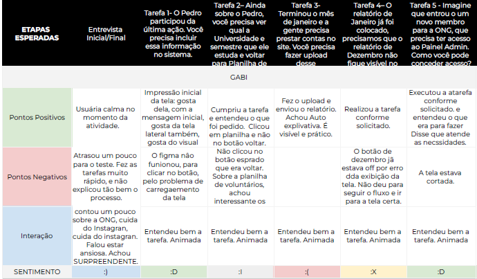
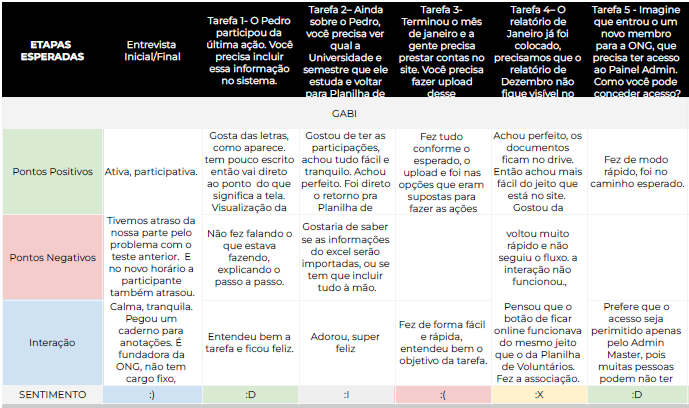
The test result was very positive, and we pointed out some elements to be improved, such as:
- Put darker gray in the texts and better organize the layout of the texts
- Back button — change place, put in the upper right corner
- See about specialty and occupation — how the names and classifications will be
- Change Flow, split tasks. Go to the volunteer worksheet, and mark that Pedro has already participated
- View Pedro’s registration details. The task has to finish with a click
- Document upload in reports. Submit report.
- Change the modal to white
- Change username for access
- Put information on the new user/access registration screen that all fields are mandatory
- View the assessment slide after each assignment. Leave the option to mark or just leave the question open and we write it down?
- Include in the specifications for the devs to leave the right labels, to help with actions
- Think ahead after testing: select yes or no for user participation and toggle the button in Details. Table filters, username search field.
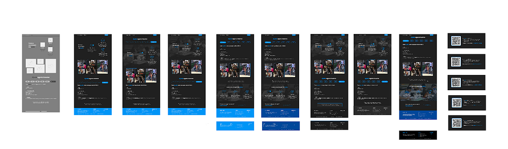
Continuing with the creation of the website, the second page we delivered was the Donations page, in which the objective was to make it possible to donate amounts that were already pre-defined and via PIX since it is the most used means of payment by donors.
The second section of the page is dedicated to explaining how the donation made helps Saúde da Rua, increasing credibility and sensitivity for the user to donate. The photo gallery also fulfills the objective of showing the beneficiaries of the donations.
Finally, a section was created to publicize the products sold by the Saúde da Rua shop. The user is directed to Instagram, through integration with the API, which is where the purchase of products works, consisting of another form of donation.
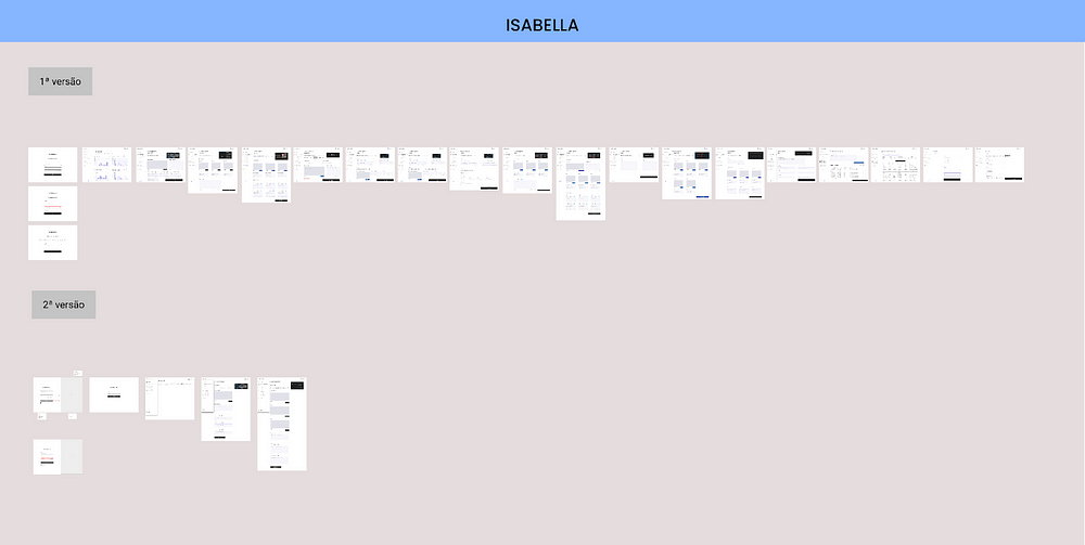
Here are the wireframes and the entire process of developing our work.
We each made medium fidelity versions of the donation page, with the aim of discussing and reaching common ground.
After being reviewed by the mentor, we set out to develop the wireframes in high fidelity.
Final Considerations
We appreciate the opportunity and all the learning that Tech Pro Bem provided us throughout the project development process.
It was challenging to carry out such a unique project during these 7 months, taking the first steps of this project together with the founders Laurem Crosseti and Nathalia Agostini, incredible professionals.Tech Pro Bem’s team is so diverse and committed, each with their particularities and contributions to the work. Thanks also to our super mentor Thais Boaventura,, who was there helping and teaching with the utmost patience and competence.
Thus, we ended the participation of our UX/UI Design team in the first project developed by Tech Pro Bem. we were the Pilot Project, and now other people will be able to act in these roles and continue this mission.
Article written by the UX/UI Design team at Tech Pro Bem — Pilot Project
Tech Pro Bem Team
Projeto Piloto — Out 2021/Maio 2022
UX/UI Designers
Bárbara Lara (Linkedin);
Fábio Mauadié (Linkedin);
Vitor Manoel (Linkedin);
Isabella de Faria (Linkedin)
Developers
Leandro Santos (LinkedIn),
Gabriel de Albuquerque (LinkedIn)
Priscila Andreani (LinkedIn)
Mariana Herreros (LinkedIn)
Guilherme Oliveira (LinkedIn)
Arthur Straub (LinkedIn)
Leonardo Paiva (LinkedIn)
Lucas
Agilists
Suzane Silva (LinkedIn)
Alessandro Mendonça (LinkedIn)